The Bureau of Labor Statistics provided unemployment and job market numbers on Friday for the period of August 2012. With 103,000 private sector jobs added in August and 7,000 public sector/government jobs eliminated, the report reflected a disappointing net gain of 96,000 new jobs.
The Bureau's August release also shows a reduction in the unemployment rate from 8.3% to 8.1%. While this is positive news on its face, the decline in the unemployment rate results mostly from a decrease in the number of Americans who are seeking work, not from an increase in the number of newly created jobs.
The big picture bad news embedded in the August job statistics is that the economy and job market continue to recover at a pace which almost everyone, including the President, finds to be unacceptably sluggish.
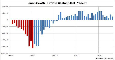
The good news is we now have 30 consecutive months of positive job growth. Additionally, according to Steve Benen on the Maddow Blog, in the first eight months of 2012 the economy yielded 1.2 million new private sector jobs, which is already better than five of the eight Bush/Cheney years in their entirety.
Our choices in the upcoming presidential election are becoming increasingly clear. Some of us will decide that President Obama has made the right choices and opt to give him four more years to finish the job of repairing a devastated economy. Others will conclude that the speed of the recovery is simply unacceptable and will opt for the Romney alternative.
Regardless of your choice, I believe it's important to pursue and process the unadulterated facts. The graph above represents actual job growth results and trends (red = Bush, blue = Obama), which I believe illustrate simply and plainly the real world impact of the policies of the current and prior White House administrations.
By the end of the Bush administration, we were losing more than 600,000 jobs per month. Under President Obama job growth has been slow, but steady and positive.
My question for Mr. Romney is this - what specifically are you proposing that is different from the Bush-era policies that led to so much of the "red ink" and job loss in the chart above?

My concern with this graph is it does not address the 'types' of jobs. For example, if one job that paid 100k was lost, but 5 jobs paying 20k were created, that would be a net gain of four 'jobs.' The problem is those are a lot stinkier than the one that was lost. Sure, more people are working, but the net wages is stagnant.
ReplyDeleteUnder-employment is a big deal, too.
I'm just sayin'.
Understood....nonetheless, a gain of 100K mediocre new jobs is still way better than the loss of 750K jobs of any type.
ReplyDelete